Creating User GL report templates is a fairly straight-forward activity with the setup tool that leads you through the questions required to write a report. The hardest part (as always with reports) is working out what you want to see, and in what sequence. Below is a step-by-step sample of some of the functions and features available when writing these templates to provide an overview of the potential. There is practically an unlimited number of different GL Reports that could be generated with this tool.
Step 1 – Details
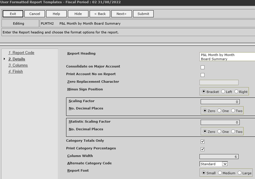
Apart from giving the report a “heading” or name, there are many options available to control how the report works at this step. Soe of the features provided are described below:
- the ability to replace any zero’s with a word/character e.g. “*” or the word “Nil”
- Position/style of “negative” figures
- Scaling factors – great when you know you are going to have trouble fitting things on the page
- Decimal places – as with scaling, allows you to reduce the size of columns, or just simply the report
- Consolidation – reports can show major or minor chart of account balances based on the setting
- Categories – you can use the ‘Alternate’ category structures if you have created them as well as choose the option to simply show GL Category totals which hides all the chart of account details
Step 2 – Columns
Columns are entered in a list by clicking the “Add” button on the screen whilst changing a column simply requires the user to click on the ‘row’ to edit the details within.
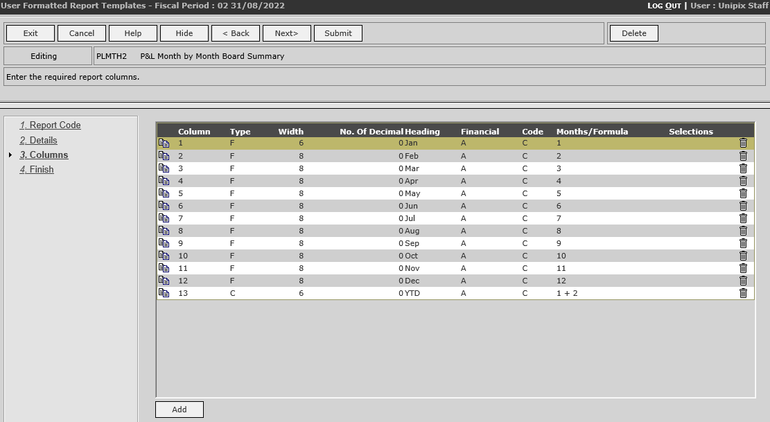
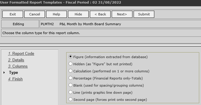
The first user input for a new column is to select type of column to add to the report. The column types available are displayed along with an explanation as per the sample shown here.
The detail of a “Figure” column is shown below. Apart from being able to set a column heading and over-ride the number of decimal places/width, there are some important questions relating to the “Figures” that are to be shown in the column.
Firstly, the “Financial” prompt allows the user to choose either “Actual”, “Budget” or ‘Forecast” data. Then the user can pick the financial period for figures allowing you to select what GL balances are shown for a given column. Note how individual months can be selected, or multiples to allow for running totals, quarterly totals or annual totals as needed.
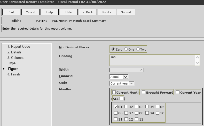
The user can set the “period” to show in a given column from the list below:
- Current Year
- Last Year
- Previous Year
- Previous Year (minus 1)
- Previous Year (minus 2)
- Previous Year (minus 3)
- Previous Year (minus 4)
- Previous Year (minus 5)
Finally, the choice of which month or months need to be made. As you can see from the screen sample there are a number of ways to select the months to include. We have provided easy to use checkboxes so a user can select “ALL” months or “Current Month”, “Brought Forward” balance” or “Current Year”.
After entering this detail, the user moves on to the “Selections” sub-step.
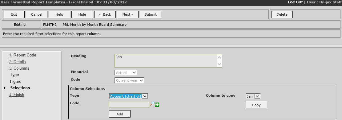
It is an entirely optional step, but is does give the “author” the ability to establish very specific rules about what “data” is included or excluded for the column. All the “elements” listed as being available to report on can be used here to filter the data used to calculate the figures for each column. There is even a handy “copy” tool so you can copy these rules from other columns to save having to set them up each time. Using these column based selections a user can create reports where each column then represents a “Branch”, a “Division”, a “GL Category”, a “Statistic” and even a specific “Chart Of Account”. Even combinations of these can be used with multiple selections per type so that the column has very specific filters applied when it runs.